Currently in first year studying art & design at Limerick School of Art & Design (LSAD).
This is a blog documenting my research and development of our first year brief "To Sense My Space".
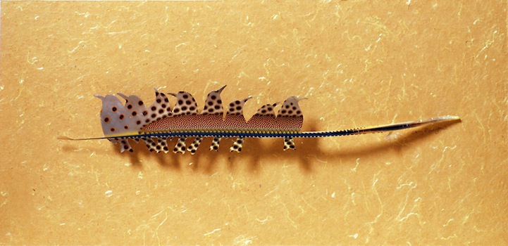
Washington-based artist Chris Maynard is a feather fanatic! He uses feathers as his medium because he says, "They are an ultimate achievement of nature and a pinnacle of wonder." His goal is to feature the natural patterns, colors, and shapes of a bird's feathers in a new and different light compared to how it originally grew and functioned on the bird's body.
WIth this in mind, Maynard creates all kinds of interesting shadowbox designs that mimic the natural form of a bird's feathers. In his work, layers of overlapping feathers, single isolated feathers, and repetitive patterns are the main focus. From that central point, the artist carves intricate feather birds that grow and emerge, and flap their wings as they fly away.
As unique as every bird, each one of Maynard's pieces is an original that cannot be duplicated. Maynard says creation of these pieces requires various design and crafting techniques and that his favorite tools to use are his fine eye surgery forceps, scalpels, and magnifiers. He spends a lot of time identifying the proper feathers to use to complete his vision and all of the shadowbox framings incorporate only legally acquired materials.
I'm now looking into using different textures to give my work a greater appeal to those with limited senses [TOUCH]. . .
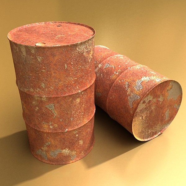
In an effort to replicate the rusty texture of a barrel, I decided to melt crayons on paper, using an iron. The result looked good but in relation to how it felt . . . . well the melted wax clumped to produce a bumpy, blotchy effect which felt waxy to touch. It may not be very textural but it was something simple to begin with and also LOTS OF FUN!
I used a cheese grater, greaseproof paper,
crayons, ironing board, iron and a large sheet of white paper.
I started by grating a green crayon onto the paper.
I decided to mix it with yellow.
Placing the greaseproof paper on top, I melted the crayon.
The result looked something like this.
The setup in the kitchen.
Super fun time with crayons. :P
Adding more colours. . . . . . .
Because of the consistency of the crayon, the paper was translucent around the waxy spots,
Combining both the idea of industrial space with the sense of being blind and sensing your space. So I blindfolded myself and walked around the studio recording the sounds of objects as I bumped into them chairs scraping, then reinterpreted the recordings through visual drawings of what the space sounded like. Found an artist who worked on a similiar project. His name is Brandon LaBelle.
Iran do Espírito Santo was born in Mococa, Brazil in 1963. In 1986 he received a B.A. at the Fundação Armando Alvares Penteado in São Paolo.
One of Brazil's most interesting contemporary artists, Iran is best known for his sensuously minimalist work that deals with issues of place, structure, material, design, and surface with a rigorous conceptual sensibility. His work undertakes a subtle subversion of Minimalism through abstracted everyday items. Iran is concerned with the tactile attributes of his chosen materials and with the sensuous contours of simple abstract forms in space. Working in stainless steel, glass, copper, stone or paint on plaster, he employs subtle illusionistic devices, instigating a play of depth that remains consistent from piece to piece.
The Blommers/Schumm optical illusion portraits make you work to see what pictures hide beyond the mirage. In order to be able to view the portraits you must either move away from your computer screen or tilt your head at an awkward angle.
The repeated black and white-lined pictures are severely disorienting to stare at. However, behind all those disturbing lines that cause your eyes to cross, there are hidden fashion photos. The easiest one to see is the one of a young man poised on a chair in a bulky red suit.
The Blommers/Schumm optical illusion portraits were created specifically for Hector Magazine. As a warning, these photos should not be viewed on a full stomach or for long amounts of time. They may cause you to question your reality.
London-based artist Idris Khan was born in the UK in 1978. Since completing his Master’s Degree with a Distinction in Research at the Royal College of Art in London in 2004, he has received international acclaim for his minimal, yet emotionally charged photographs, videos and sculptures and is without question one of the most exciting British artists of his generation.
"Every... Bernd And Hilla Becher..." series.
Since 1959 Bernd and Hilla Becher have been photographing industrial structures that exemplify modernist engineering, such as gas reservoirs and water towers. Their photographs are often presented in groups of similar design; their repeated images make these everyday buildings seem strangely imposing and alien. These are a series of photographic prints by Idris Khan named "Every... Bernd And Hilla Becher..." series. Idris Khan appropriates the Bechers’ imagery and compiles their collections into single super-images.
Print 1
In this piece, multiple images of American-style gabled houses are digitally layered and super-imposed giving the effect of an impressionistic drawing or blurred film still.
Print 2
The structures in the Bechers’ original photographs are almost identical, though in Khan’s hands the images’ contrast and opacity is adjusted to ensure each layer can be seen and has presence. Though Khan works in mechanised media and his images are of industrial subjects, their effect is of a soft ethereal energy. They exude a transfixing spiritual quality in their densely compacted details and ghostly outlines. ...Prison Type Gasholders conveys a sense of time depicted in motion, as if transporting the old building, in its obsolete black and white format, into the extreme future.
Print 3
The Bechers took their photos as a means to document a disappearing tradition; by grouping them according to ‘typology’ the buildings’ designs function like archetypal symbols or an architectural language. Through Khan’s translucent aggregations, structures such as ...Spherical Type Gasholders lose their commanding simplicity and rigid formalism and descend into fractured and gestural blurs. Through his photographs Khan compresses the timeline of repetition into indivisible subsuming moments and creates a poetic mutability from the fixed codes of history.
I started a texture notebook after a tutorial with Elaine thinking about how I could adapt my work to appeal to more people (eg. the visually impared). When I started the brief I began by investigating blindness and focusing my work aroung our sense of sight. I collected lots of textured fabrics pieces of corrugated cardboard, scrunched up tinfoil, cotton wool, bark etc and compiled them in a texture notebook so I could refer back to it and gradually add to it throughout the year so I would have a build-up of work. I think t will be very useful. See some pictures below :
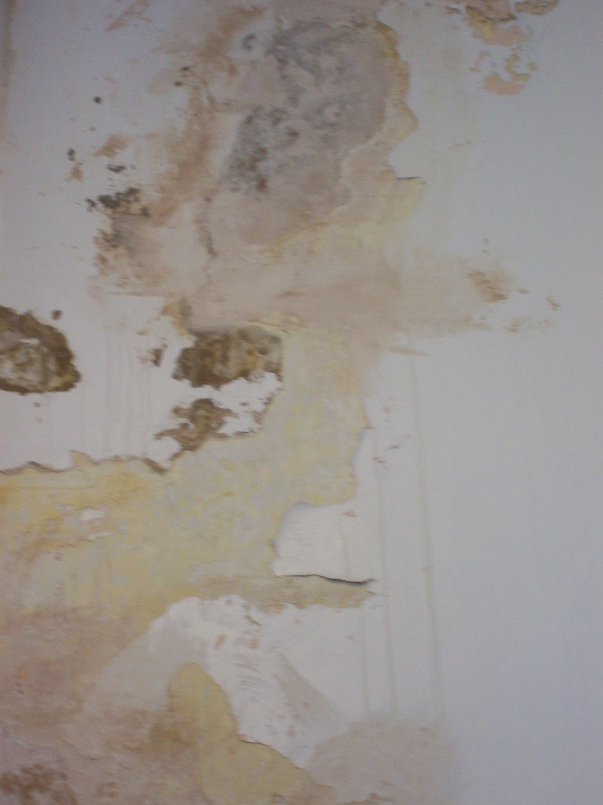
These photos are taken from up near the viscom room, 3rd floor of the college where there is damp on the walls and the paint has begun to peel.
Also took these photos of bark. . . .
They have a great textural quality and lovely subtle shades of yellows and brown.